
使用するパッケージ(パッケージのインストール)
R
library(ggplot2)
library(ggsignif)ファイル”ebar”をdatに格納します (ファイルの読み込み)
R
dat <- read.csv("ebar.csv", header = T, fileEncoding = "UTF-8")R
head(dat)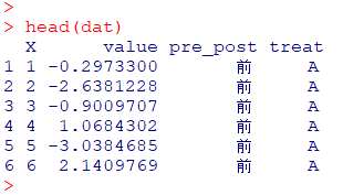
列pre_postの配列を確認します
R
#まずはfactor変数に変換します
dat$pre_post <- as.factor(dat$pre_post)
#factor変数にすることでレベルが付与されます
levels(dat$pre_post)
このままではx軸が後→前の配列になるので入れ替えます
R
dat$pre_post <- relevel(dat$pre_post, ref="前")
#確認してみます
levels(dat$pre_post)
これでx軸の準備は完了
ggplotの基本的な描き方です
R
(g1 <- ggplot2::ggplot(dat, aes(x = pre_post, y = value)))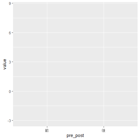
R
(g2 <- g1 + geom_point())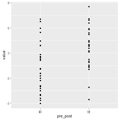
R
(g3 <- g2 + theme_bw())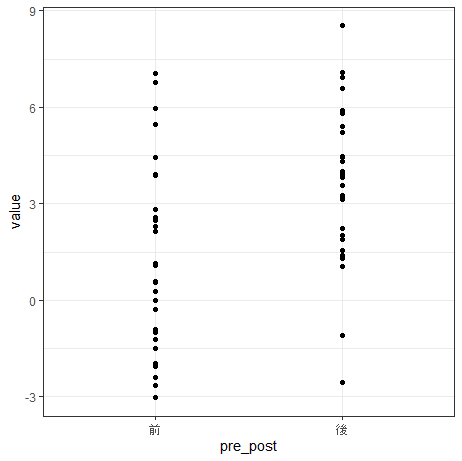
それでは実践編へ
標準誤差をエラーバーとしたグラフを描きます
R
pos1 <- ggplot2::position_jitterdodge(
  jitter.width  = 0,#横にずらす
  jitter.height = 0,#縦にずらす
  dodge.width   = 0.5#カテゴリで分ける
)

(g4 <- ggplot(data = dat,
  aes(
    x = pre_post,
    y = value,
    colour = treat
  )
))
R
(g5 <- g4 +
  geom_jitter(alpha = 0.4, position = pos1) +  #alpha重なりの濃さ
  stat_summary(aes(x = as.numeric(pre_post) + 0.07),
  fun = "mean", geom = "point", size = 3, position = pos1)
)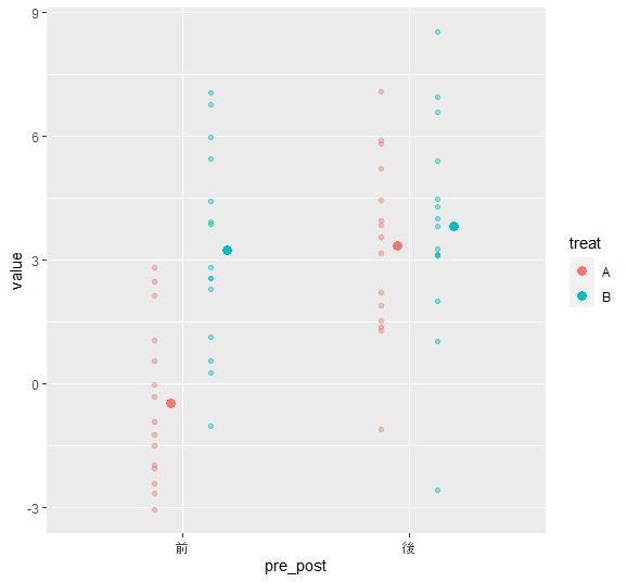
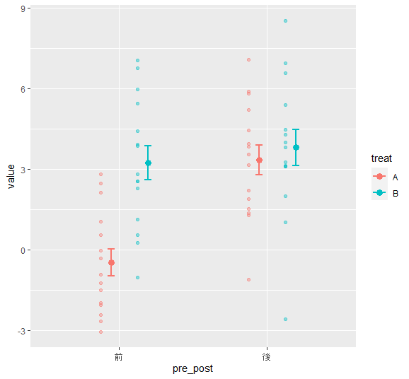
標準誤差(fun.data = “mean_se”)
R
(g6 <- g5 +#平均値のプロット
  stat_summary(aes(x = as.numeric(pre_post) + 0.07),
    fun.data = "mean_se",
    geom = "errorbar",
    width = 0.1,#ひげの横幅
    lwd = 1,#ひげの棒の幅
    position = pos1
))
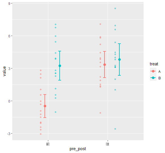
95%信頼区間(fun.data = “mean_cl_normal”)
R
(g7 <- g5 +#平均値のプロット
    stat_summary(aes(x = as.numeric(pre_post) + 0.07),
    fun.data = "mean_cl_normal",
    fun.args = list(conf.int = 0.95),#信頼区間のときに使用する
    geom = "errorbar",
    width = 0.1,#ひげの横幅
    lwd = 1,#ひげの棒の幅
    position = pos1
  ))
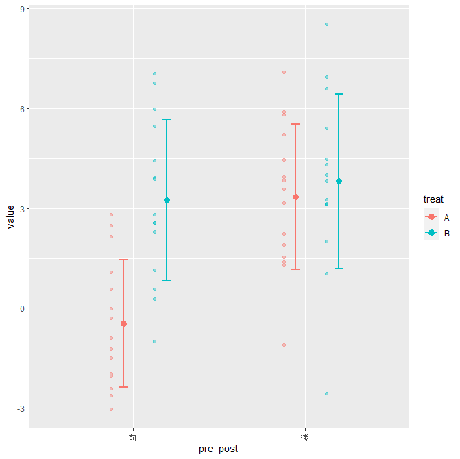
標準偏差
R
(g8 <- g5 +
    stat_summary(aes(x = as.numeric(pre_post) + 0.07),
    fun.min=function(x) mean(x)-sd(x),
    fun.max=function(x) mean(x)+sd(x),
    geom = "errorbar",
    width = 0.1,#ひげの横幅
    lwd = 1,#ひげの棒の幅
    position = pos1
  ))
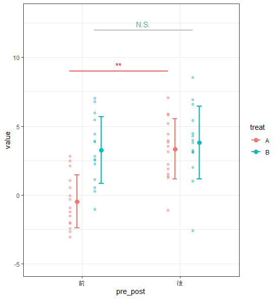
治療Aと治療Bのそれぞれの前後差をt検定(独立した4群と仮定)
R
t.test(value ~ pre_post , data =dat[dat$treat=="A",])$p.value
t.test(value ~ pre_post , data =dat[dat$treat=="B",])$p.value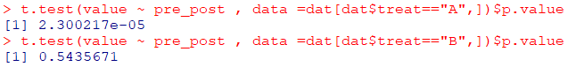
治療Aは有意差あり(**)、治療Bは有意差なし(N.S.)
R
(g9 <- g8 +
    ggsignif::geom_signif(
        stat = "identity",
        data = data.frame(
            x = c(0.87, 1.12),
            xend = c(1.87, 2.12),
            y = c(9, 12),
            annotation = c("**", "N.S.")
            ),
        aes(
            x = x,
            xend = xend,
            y = y,
            yend = y,
            annotation = annotation
            ),
        col = c("red","#20B2AA")
    )
) + ylim (-5,13) + theme_bw()