

2026-7-13
TUG
介入群と対照群の箱ひげ図
R
# データ
介入群 <- c(5, 7, 8, 9, 10, 10, 11, 12, 13, 15)  # 平均10

対照群 <- c(10, 11, 13, 14, 13, 13, 16, 17, 9, 12) # 平均15

#箱ひげ図
boxplot(介入群, 対照群, names = c("介入群", "対照群"))検定:対応のない2群の比較(student t test)
R
t.test(介入群, 対照群)歩行練習時間とFIM運動項目の相関
R
# 暴露、週の歩行練習時間(時間/週)
歩行練習時間 <- c(
  3, 2.5, 4.5, 3.5, 3, 3.5, 4, 2.5, 4, 4,
  1.5, 1, 2, 3, 2, 1.5, 1, 3.5, 1.5, 2)

# アウトカム
FIM運動項目 <- c(
  59, 45, 68, 55, 53, 41, 49, 43, 62, 68,
  53, 50, 40, 42, 43, 42, 40, 55, 46, 55
)

plot(歩行練習時間, FIM運動項目)歩行練習時間、FIM運動項目、COPDのデータセット
R
# 暴露、週の歩行練習時間(時間/週)
歩行練習時間 <- c(
  3, 2.5, 4.5, 3.5, 3, 3.5, 4, 2.5, 4, 4,
  1.5, 1, 2, 3, 2, 1.5, 1, 3.5, 1.5, 2)

# アウトカム
FIM運動項目 <- c(
  59, 45, 68, 55, 53, 41, 49, 43, 62, 68,
  53, 50, 40, 42, 43, 42, 40, 55, 46, 55
)

# COPD(1=あり, 0=なし)
COPD <- c(
  0,1,0,0,1,1,1,1,0,0,
  0,1,1,1,0,0,0,1,0,1
)

data <- data.frame(歩行練習時間, FIM運動項目 , COPD)
View(data)歩行練習時間、FIM運動項目、COPDのグラフ
R
# COPDで色分け
col <- ifelse(COPD == 1, "red", "blue")

# 散布図
plot(
  歩行練習時間,
  FIM運動項目,
  col = col,
  pch = 19,
  xlab = "歩行練習時間(時間/週)",
  ylab = "FIM運動項目",
  main = "歩行練習時間とFIM運動項目"
)

# 凡例
legend(
  "topleft",
  legend = c("COPDなし", "COPDあり"),
  col = c("blue", "red"),
  pch = 19,
  bty = "n"
)重回帰分析
R
data$COPD <- factor(data$COPD)
fit <- lm(FIM運動項目 ~ 歩行練習時間 + COPD)
summary(fit)2026-7-6
箱ひげ図
R
ketuatu = c(93, 119, 115, 113, 123, 139, 120, 108, 114, 102)
boxplot(ketuatu)分割表作成のためのデータセット
R
運動歴 <- c("あり","なし","なし","あり","なし","なし","あり","なし")
糖尿病 <- c("あり","なし","あり","なし","あり","なし","なし","あり")

data <- data.frame(運動歴, 糖尿病)
View(data)分割表の作成
R
tab <- table(data$運動歴, data$糖尿病)
names(dimnames(tab)) <- c("運動歴", "糖尿病")
tab2026-6-29
対象者は10名、全て70代、男性、右股関節OA.歩行速度(m/s)を示す.
JavaScript
speed <- c(1.25, 0.98, 1.02, 0.85, 1.55, 1.85, 0.96, 0.87, 1.35, 1.15)
t.test(speed)
背景因子が同じ20名の歩行可能な痙直型両麻痺児を対象とした.10人の子どもに装具療法を行ったところ,TUG *は平均で10秒であった.装具療法を実施しない子ども10名のTUGは15秒であった.
R
# データ
orthosis <- c(5, 7, 8, 9, 10, 10, 11, 12, 13, 15)  # 平均10

control  <- c(10, 12, 13, 14, 15, 15, 16, 17, 18, 20) # 平均15

mean(orthosis)
mean(control)


# データ
orthosis <- c(5, 7, 8, 9, 10, 10, 11, 12, 13, 15)
control  <- c(10, 12, 13, 14, 15, 15, 16, 17, 18, 20)

# 描画
plot(NULL,
     xlim = c(0.5, 2.5),
     ylim = c(4, 21),
     xaxt = "n",
     xlab = "",
     ylab = "TUG(秒)",
     bty = "l")

# 装具療法あり
points(rep(1, 10), orthosis,
       pch = 21, cex = 1.8,
       col = "deepskyblue2",
       bg = "white",
       lwd = 2)

text(rep(0.88, 10), orthosis,
     labels = LETTERS[1:10],
     cex = 1.2)

# 装具療法なし
points(rep(2, 10), control,
       pch = 21, cex = 1.8,
       col = "deeppink",
       bg = "white",
       lwd = 2)

text(rep(2.12, 10), control,
     labels = LETTERS[11:20],
     cex = 1.2)

# 群名
axis(1,
     at = c(1, 2),
     labels = c("装具療法あり", "装具療法なし"),
     tick = FALSE,
     cex.axis = 1.2)

# 標本数
text(1.5, 5,
     "標本:20例",
cex = 1.3)平均値の差の検定
R
t.test(orthosis, control)2026-6-22
R
x <- c(150, 132, 144, 139, 118, 135, 123, 133, 152, 136)
mean(x)
sd(x)グラフを横に並べる
R
# 推定値
mu <- 136.2
sigma <- sqrt(116)

# グラフを上下に配置
par(mfrow = c(1, 2))

########################################
# 元の尺度 X
########################################

x <- seq(mu - 4*sigma, mu + 4*sigma, length = 1000)

plot(x,
     dnorm(x, mean = mu, sd = sigma),
     type = "l",
     lwd = 2,
     xlab = "収縮期血圧 X (mmHg)",
     ylab = "確率密度",
     main = expression(X %~% N(136.2,10.77^2)))

abline(v = mu, col = "blue")
abline(v = 150, lty = 2)

# 150以上の面積
x_fill <- seq(150, max(x), length = 500)
polygon(c(150, x_fill, max(x)),
        c(0, dnorm(x_fill, mu, sigma), 0),
        col = "tomato",
        border = NA)

text(160, 0.035,
     labels = sprintf("P(X ≥ 150) = %.3f",
                      pnorm(150, mu, sigma,
                            lower.tail = FALSE)))

########################################
# 標準化後 Z
########################################

z <- seq(-4, 4, length = 1000)

plot(z,
     dnorm(z),
     type = "l",
     lwd = 2,
     xlab = "標準化変数 Z",
     ylab = "確率密度",
     main = expression(Z %~% N(0,1)))

abline(v = 0, col = "blue")

z150 <- (150 - mu) / sigma
abline(v = z150, lty = 2)

# z=1.28以上の面積
z_fill <- seq(z150, max(z), length = 500)
polygon(c(z150, z_fill, max(z)),
        c(0, dnorm(z_fill), 0),
        col = "tomato",
        border = NA)

text(2, 0.35,
     labels = sprintf("P(Z ≥ %.2f) = %.3f",
                      z150,
                      pnorm(z150,
                            lower.tail = FALSE)))

par(mfrow = c(1, 1))血圧が150以上になる確率の求め方
R
pnorm(1.28, lower.tail = FALSE)実際の解析で活用する, 血圧が150以上になる確率の求め方
R
pnorm(150, mean=136.2, sd=10.77, lower.tail=FALSE)70代、男性、右股関節OAの平均歩行速度(m/s)
R
x <- c(1.25, 0.98, 1.02, 0.85, 1.55, 1.85, 0.96, 0.87, 1.35, 1.15)
mean(x)95%信頼区間
R
t.test(x)2026-6-15
R
da <- c(1, 1, 3, 6, 9)
da代表値
R
#平均
mean(da)
#中央値
median(da)
#最頻値
as.numeric(names(which.max(table(da))))散布度
R
#標準偏差(標本標準偏差)
sd(da)
#四分位範囲
IQR(da)
#最小値,最大値
min(da)
max(da)サマリー
R
summary(da)10人の拡張期血圧
R
ketuatu = c(93, 119, 115, 113, 123, 139, 120, 108, 114, 102)
ketuatu10人の拡張期血圧の分布
R
hist(ketuatu)
stem(ketuatu)箱ひげ図
R
boxplot(ketuatu)散布図(年齢と血圧の関係)
R
nenrei = c(52, 55, 52, 56, 56, 41, 44, 56, 54, 57)
ketuatu = c(93, 119, 115, 113, 123, 139, 120, 108, 114, 102)
plot(nenrei, ketuatu)分割表
R
# データ入力
tab <- matrix(c(32, 68, 47, 53),
              nrow = 2,
              byrow = TRUE)

# 行名・列名(任意)
rownames(tab) <- c("方法A", "方法B")
colnames(tab) <- c("効果あり", "効果なし")

tab

View(tab)
フィッシャーの正確確率検定
R
fisher.test(tab)カイ二乗検定
R
chisq.test(tab)データセットの例
R
dat <- data.frame(
  方法 = c(rep("方法A", 100), rep("方法B", 100)),
  効果 = c(rep("あり", 32), rep("なし", 68),
           rep("あり", 47), rep("なし", 53))
)

View(dat)
2026-6-8
R
#Rは計算機です
#足し算
1+1
#掛け算
5*6
#割り算
9/3
#べき乗
3^2
#平方根
sqrt(16)
#演算子の後ろで改行はOK
80*200/8+66*200/8+
80*200/8参考資料
R
data <- data.frame(
  id = 1:10,
  nenrei = c(52, 55, 52, 56, 56, 41, 44, 56, 54, 57),
  seibetu = c(0, 0, 0, 0, 0, 1, 1, 1, 1, 1),
  sincho = c(169.9, 172.1, 175.7, 173.1, 165.3, 155.1, 155.2, 157.2, 148.2, 156.4),
  taiju = c(77.1, 60.3, 74.0, 67.5, 70.8, 54.7, 62.2, 57.7, 51.1, 53.6),
  taishibo = c(24.0, 21.8, 23.8, 27.1, 30.0, 28.7, 34.8, 30.0, 34.6, 25.4),
  ketuatu = c(93, 119, 115, 113, 123, 139, 120, 108, 114, 102),
  k_kiou = c(0, 1, 1, 1, 1, 1, 0, 0, 1, 0)
)

data> data
id nenrei seibetu sincho taiju taishibo ketuatu k_kiou
1 1 52 0 169.9 77.1 24.0 93 0
2 2 55 0 172.1 60.3 21.8 119 1
3 3 52 0 175.7 74.0 23.8 115 1
4 4 56 0 173.1 67.5 27.1 113 1
5 5 56 0 165.3 70.8 30.0 123 1
6 6 41 1 155.1 54.7 28.7 139 1
7 7 44 1 155.2 62.2 34.8 120 0
8 8 56 1 157.2 57.7 30.0 108 0
9 9 54 1 148.2 51.1 34.6 114 1
10 10 57 1 156.4 53.6 25.4 102 0R
label <- data.frame(
  variable = c("id", "nenrei", "seibetu", "sincho", "taiju", "taishibo", "ketuatu", "k_kiou"),
  label = c(
    "id",
    "年齢",
    "性別(0=男, 1=女)",
    "身長",
    "体重",
    "体脂肪率",
    "収縮期血圧",
    "高血圧既往歴(0=無、1=有)"
  )
)

View(label)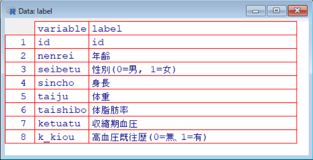
代表値
R
data2 <- data[, c("nenrei", "sincho", "taiju", "taishibo", "ketuatu")]
# 平均
sapply(data2, mean)
# 中央値
sapply(data2, median)
# 最頻値
as.numeric(names(which.max(table(data$k_kiou))))散布度
R
# 標準偏差
sapply(data2, sd)
# 四分位範囲
sapply(data2, IQR)
# 最小値
sapply(data2, min)
# 最大値
sapply(data2, max)グラフ
グラフ(血圧)ヒストグラム
R
hist(data$ketuatu)グラフ(血圧)箱ひげ図
R
boxplot(data$ketuatu)グラフ(血圧)散布図
R
ggplot(data, aes(x = factor(seibetu, levels = c(0, 1)),
                 y = ketuatu,
                 color = factor(seibetu))) +
  geom_point(size = 2) +
  scale_color_manual(values = c("0" = "blue", "1" = "red")) +
  scale_x_discrete(labels = c("0" = "男性", "1" = "女性")) +
  theme_classic() +
  xlab("性別") +
  ylab("血圧 (mmHg)") +
theme(legend.position = "none")グラフ(血圧)エラーバーグラフ
R
library(dplyr)
library(ggplot2)

# 性別をラベル化
data$seibetu <- factor(data$seibetu,
                       levels = c(0, 1),
                       labels = c("男性", "女性"))

# 集計
summary_data <- data %>%
  group_by(seibetu) %>%
  summarise(
    mean = mean(ketuatu, na.rm = TRUE),
    sd   = sd(ketuatu, na.rm = TRUE),
    n    = n(),
    se   = sd / sqrt(n)
  )

# プロット
ggplot(summary_data, aes(x = seibetu, y = mean, color = seibetu)) +
  geom_point(size = 4) +
  geom_errorbar(aes(ymin = mean - se, ymax = mean + se),
                width = 0.15) +
  scale_color_manual(values = c("男性" = "blue", "女性" = "red")) +
  theme_classic() +
  ylab("血圧 (mmHg)") +
  xlab("性別") +
theme(legend.position = "none")散布図(年齢と血圧の関係)
R
plot(data$nenrei, data$ketuatu)高血圧既往歴の度数分布表と円グラフ
JavaScript
# 度数分布表の作成
table(data$k_kiou)

# 円グラフの作成
pie(table(data$k_kiou))