

例題
地域在住の60代と80代の女性を対象として、自主的に毎日体操しているA群、運動指導を受けているB群、運動指導を受けてかつ毎日自主的に体操しているAB群の肩関節屈曲可動域を計測します。肩関節屈曲可動域に年齢や運動により可動域の差はあるか、また年齢と運動の交互作用の効果について有意水準5%で検証します。
僕が作った架空のデータで練習しましょう。結果についてはご意見があると思いますが、統計学の練習のためのサンプルですのでご了承ください。平方和の分解などは、以下の二元配置分散分析(繰り返し測定なし)のページをご参照ください。

データの準備と要約
使用するパッケージ(パッケージのインストール)
R
library(psych)
library(tidyr)
library(ggplot2)
library(dplyr)
データセット anova03 をdatに格納します(ファイルの読み込み)
要因A:method(A, B, AB),
要因B:age(60代, 80代)
帰無仮説1:method(要因A)によってrangeの平均値は変動しない
帰無仮説2:age(要因B)によってrangeの平均値は変動しない
帰無仮説3:methodとageの間に交互作用はない
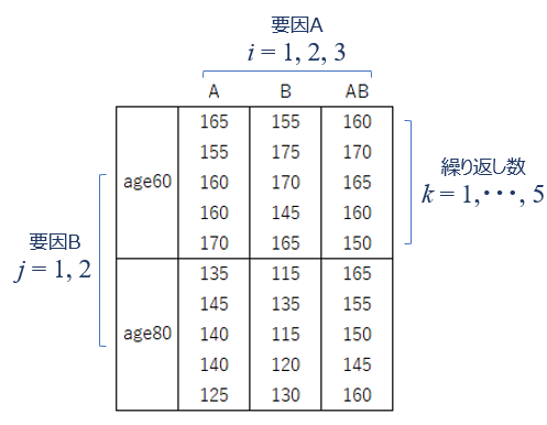
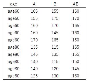
サンプルは以下のような横持ちのデータセットになっています
縦のデータセットに変換(縦持ち)
R
dat2 <- tidyr::gather(
    dat,
    key=method,
    value=range,
    -age)
head(dat2)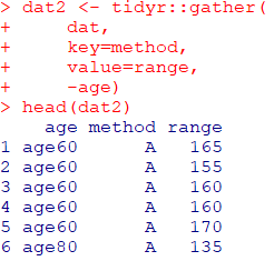
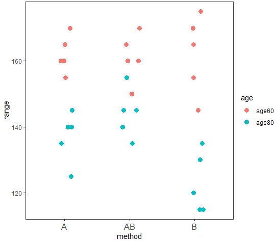
重なりが分かるように少しずらしてます
R
#グラフの描き方
g1 <- ggplot2::ggplot(
dat2,
aes(x = method, y = range)
)
g2 <- g1 + geom_jitter(
height=0, width =0.15, size = 3, aes(colour = age)
) + theme_test()
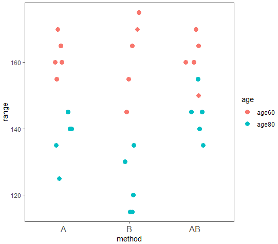
g2 + theme(axis.text.x = element_text(size = 12)) 見にくいので、A → B → AB の順番に並び変えましょう
R
#methodをファクター変数に変更します
dat2$method <- as.factor(dat2$method)
#これでレベルが付与されました
levels(dat2$method)
#transform関数でレベルを入れ替えましょう
dat3 <- transform(
dat2,
method = factor(
method, levels = c("A", "B", "AB")
)
)
#これでレベルの順序が変更されているか確認
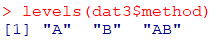
levels(dat3$method)
R
#グラフの描き方、dat2をdat3に変更して再度描きなおします
g1 <- ggplot2::ggplot(
    dat3,
    aes(x = method, y = range)
)

(g2 <- g1 + geom_jitter(
    height=0,
    width =0.15,
    size = 3,
    aes(colour = age)
) + theme_test()) + theme(axis.text.x = element_text(size = 12))
これでageとmethodの関係がなんとなく分かりますね。
データを可視化することはとても大切ですね。